Creative Signal Report: Type Makes Brand Values Tangible
Variable marks express plurality, rounded geometry makes utility feel human, and reworked heritage gives familiar categories a distinctive voice. Typography carries the brand idea into the form of the letters.
Top Signals
The original three findings, paired with recoverable case-study evidence. Strategic readings are identified as interpretation.
1
Variable Marks Become Value Systems
Flexible logotypes embody inclusivity, plurality, and local multiplicity.
Rounded geometric systems for utility and care categories.
Operational Attitude
Brand ideas encoded into glyph behavior and motion rules.
Mutant Heritage
Historic forms reworked for social speed and shelf impact.
Calm Institutional Clarity
Culture brands using type pairings to make complexity navigable.
Reference Library
Recovered project artwork, not original May screenshots. Every row links to its credited source.
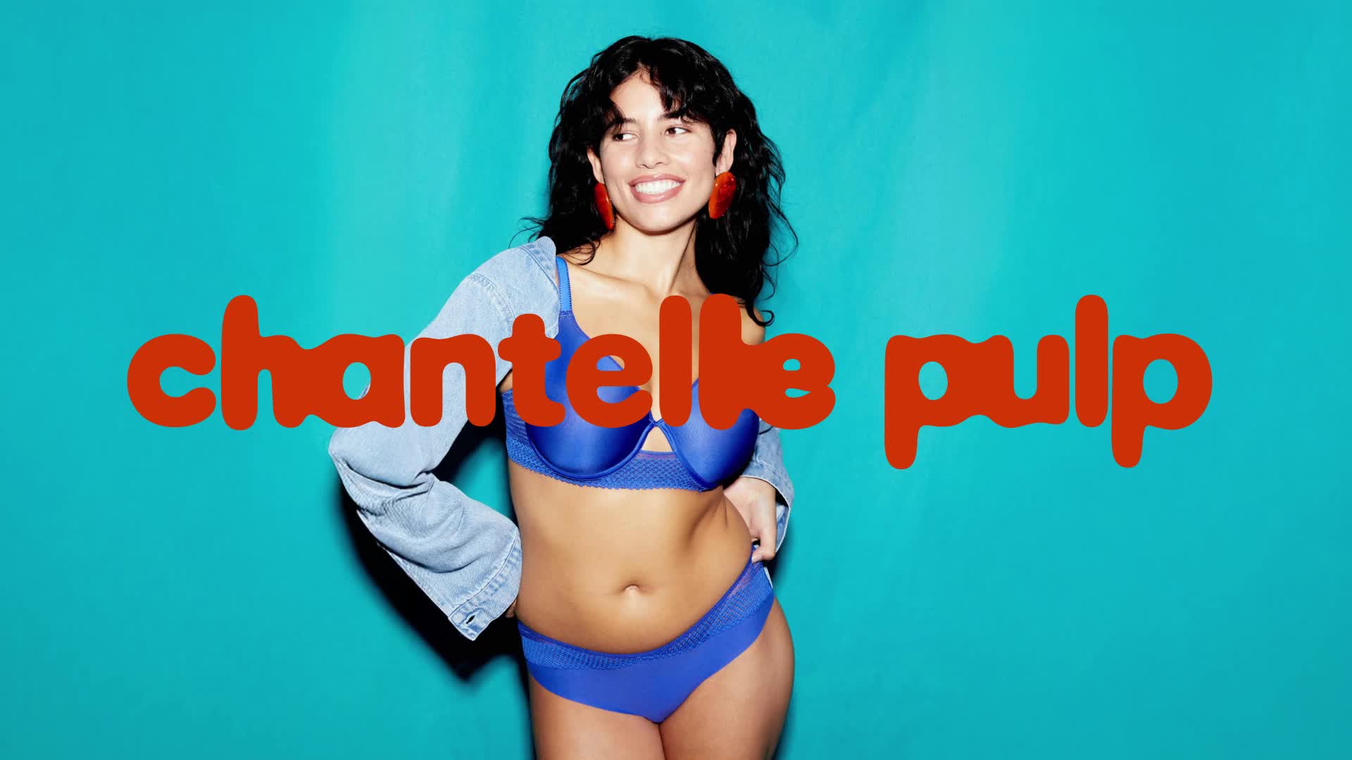
Chantelle × Monotype / source-video frame at 00:03; recovered 29 October 2026
Chantelle Pulp / Lingerie / variable identity
Plurality Becomes a Typographic Capability
Observed in Recovered Artwork
A recovered Monotype demonstration places an irregular, rounded wordmark across campaign imagery. The case study describes a custom logotype with two variable axes.
Interpretation
The mark offers a repeatable way to express difference within one identity. Its strategic value depends on a clear relationship between variation and the brand’s commitment to plurality.
Chantelle creative team with Monotype; Natalia Kotkowska, Renaud Cambuzat and Damien Collot.
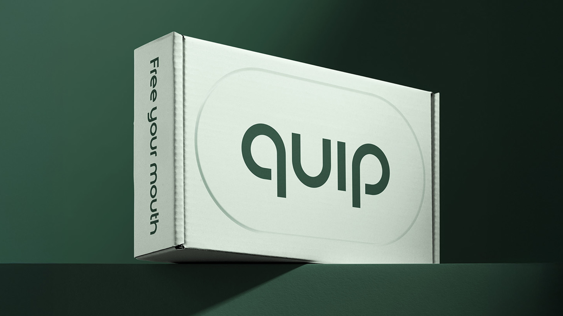
Center / quip packaging artwork via BP&O, published 7 April 2026; recovered 29 October 2026
quip / Oral care / identity system
Rounded Clarity Gives Utility a Human Voice
Observed in Recovered Artwork
Mirrored q/p forms and open, geometric lowercase lettering anchor a pale-green product carton. The pill-shaped enclosure echoes the product’s smooth physical form.
Interpretation
A utility category can become approachable through typographic proportion and rhythm. Warmth works best when it supports a clear product promise and reliable use.
Brand identity by Center; quip Sans with Burn Type. Original identity: Gin Lane.
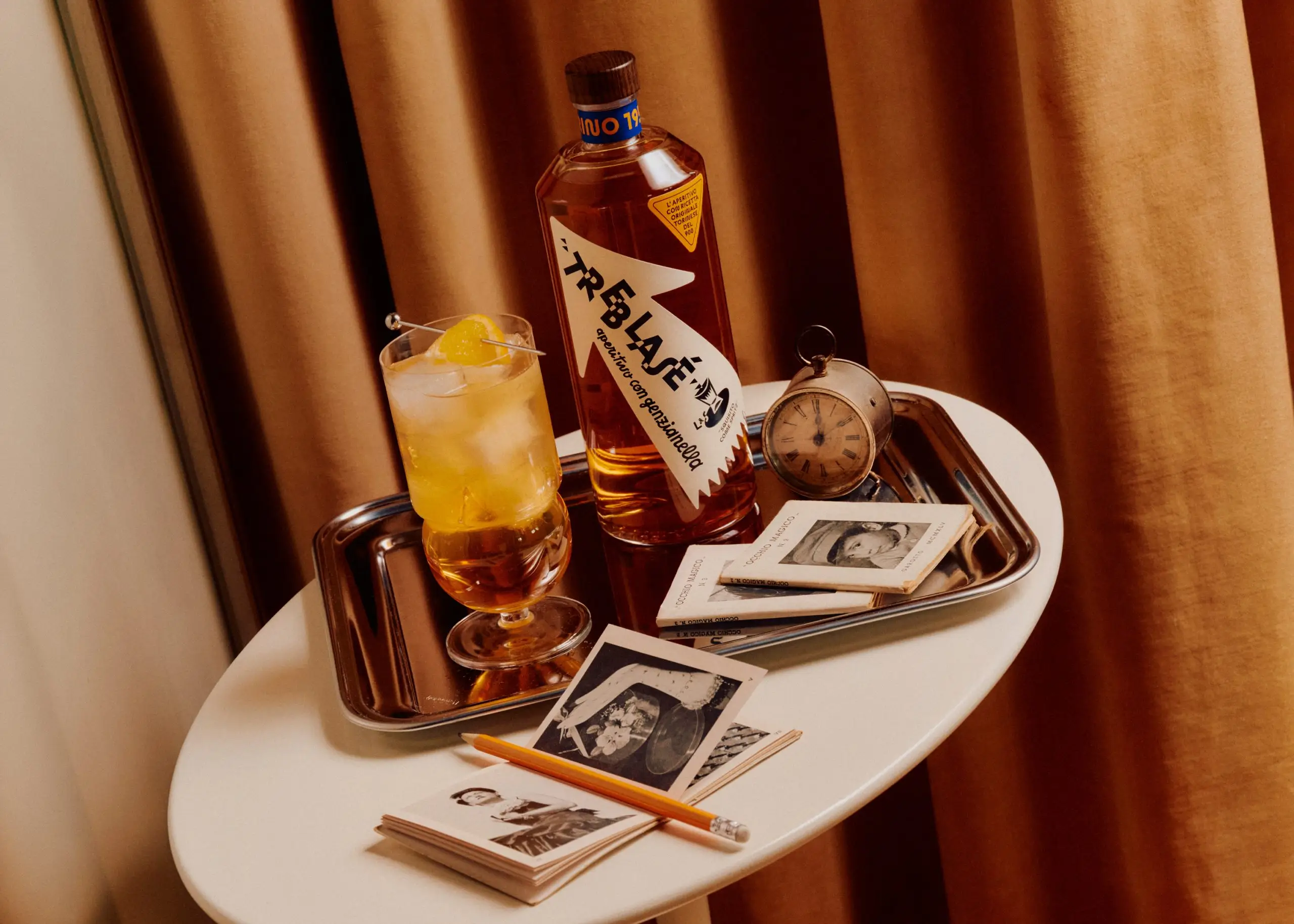
Olssøn Barbieri / Treblasé artwork via BP&O, published 21 April 2026; recovered 29 October 2026
Treblasé / Aperitivo / packaging identity
Heritage Gains Energy Through Controlled Disruption
Observed in Recovered Artwork
Angular, staggered lettering sits inside an arrow-like bottle label. Warm photographic styling places the unusual letterforms alongside the ritual of an aperitivo.
Interpretation
Historic references become useful when they inform the brand’s own formal rules. Deliberate irregularity can make heritage feel active; legibility still has to survive the shelf.
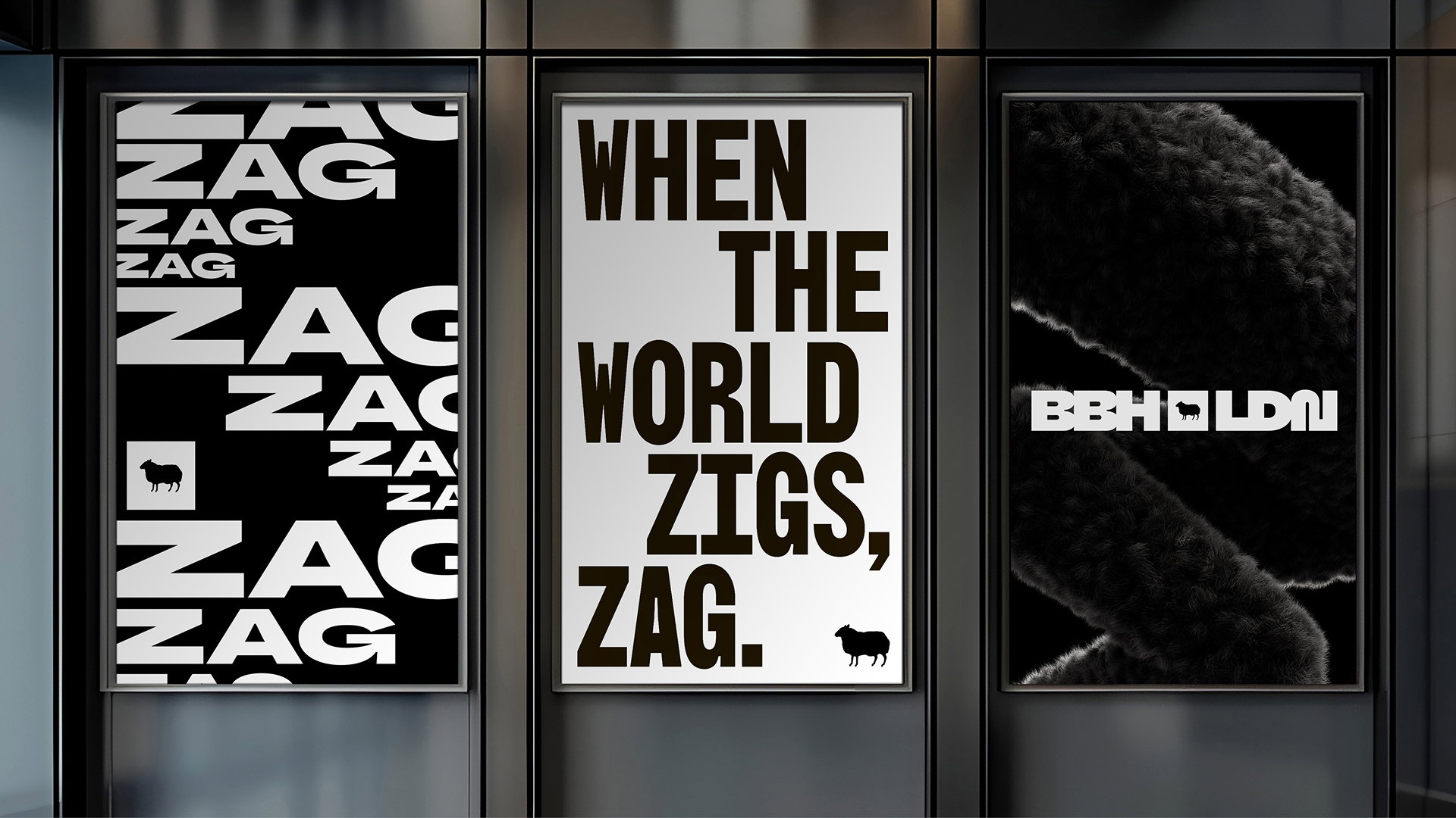
BBH × Studio DRAMA / artwork via It’s Nice That, published 26 February 2026; recovered 29 October 2026
BBH / Creative agency / typographic identity
An Agency’s Attitude Becomes a Set of Letterforms
Observed in Recovered Artwork
Black-and-white posters shift between broad and condensed type, repeating the agency’s zag language beside the black-sheep identity.
Interpretation
A recognizable point of view becomes easier to repeat when it has a typographic system. The useful test is whether that system keeps producing coherent decisions across applications.
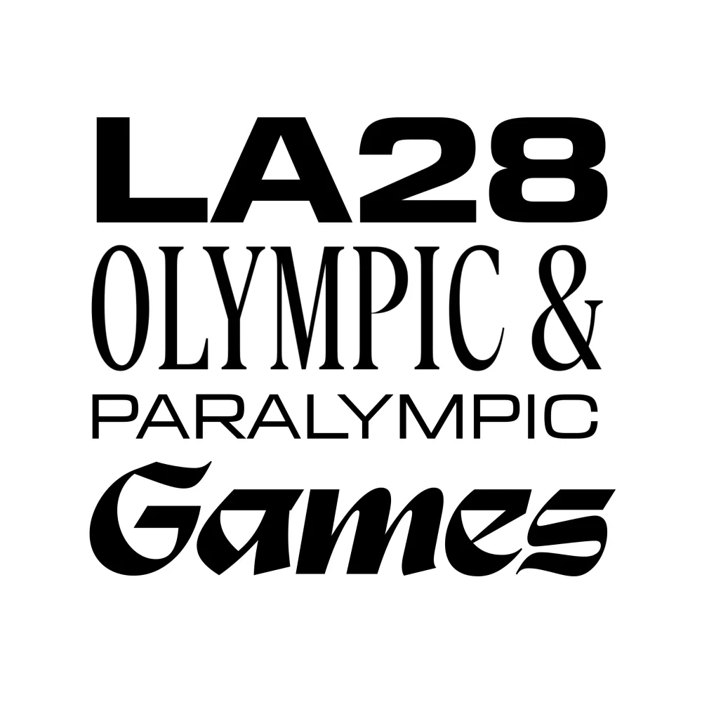
LA28 / official type specimen recovered 29 October 2026; Look of the Games announced 23 March 2026
LA28 / Sport / civic identity
Local Multiplicity Becomes a Coherent Type System
Observed in Recovered Artwork
A recovered official specimen stacks four sharply different typographic voices. LA28’s source describes a system inspired by the mixed lettering of city street signs.
Interpretation
Plurality can come from a controlled family of contrasts rather than one changing mark. Shared layout rules can hold those voices together without erasing their differences.
LA28 brand design team; Ric Edwards credited in the official announcement.
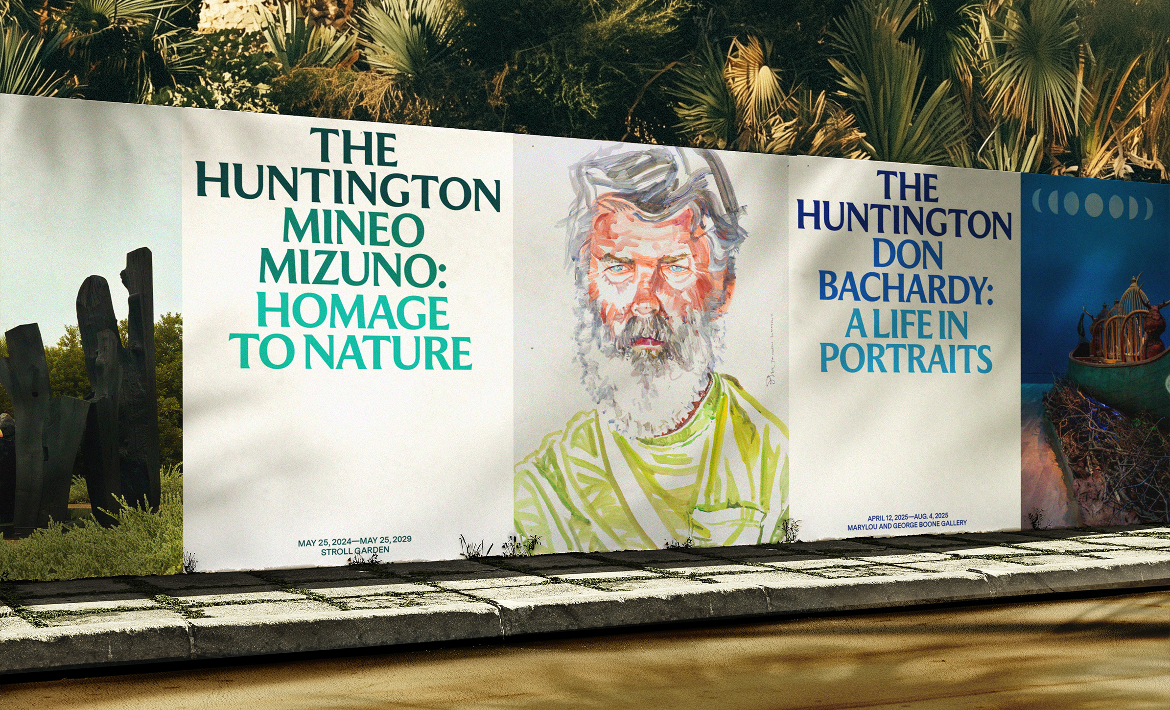
Base Design / The Huntington artwork via BP&O, published 15 January 2026; recovered 29 October 2026
The Huntington / Culture / institutional identity
A Consistent Type Voice Connects Different Collections
Observed in Recovered Artwork
Exhibition posters repeat flared, sculptural letterforms across different subjects and imagery. Color changes while the heading hierarchy remains recognizable.
Interpretation
Institutional identity can clarify the relationship among many programs through a stable typographic voice. Character needs enough range to serve everyday information as well as major announcements.
Brand identity by Base Design; source identifies Moulin by Commercial Type for headlines.
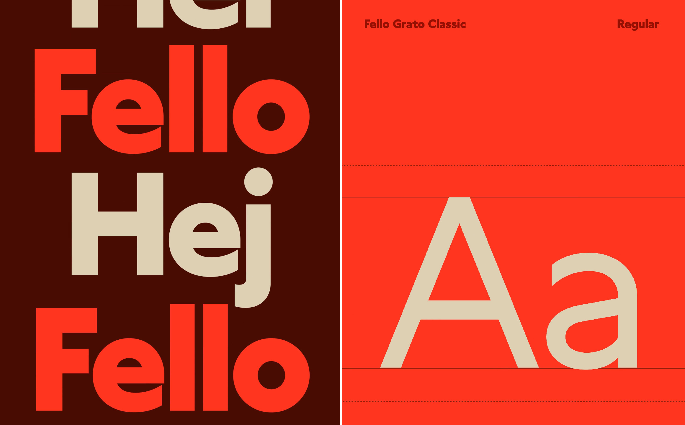
Bold Scandinavia / Fello specimen via BP&O, published 29 January 2026; recovered 29 October 2026
Fello / Telecom / identity system
Friendly Geometry Can Still Do Everyday Work
Observed in Recovered Artwork
The recovered Fello Grato Classic specimen pairs large circular forms with a clear regular-weight alphabet. A small set of warm colors does most of the visual work.
Interpretation
Friendliness can live in the structure of a working typeface. A service brand gains more from that consistency when pricing, messages and navigation remain straightforward too.
Identity by Bold Scandinavia; Fello Grato Classic, based on Grato Classic by TypeMates.
Set one product message in three typographic behaviors: fixed mark, elastic mark, and editorial display. Stress-test each at app/header scale, landing-hero scale, and packaging/social scale. Remove imagery and ask which version communicates brand value fastest.
Keep the message, color and context fixed. Compare unaided recognition, perceived brand value and small-size readability; record where each behavior helps or breaks.