Weekly PullJune 13, 2026Creative Signal Scanner V2
Creative Signal Report
This week, the strongest digital design work is replacing generic polish with evidence: operational proof for AI, social intimacy for membership, place texture for commerce, and archive logic for taste.
Field evidence for how systems communicate meaning through signals, structure, behavior, culture, and consequence.
Top Signals
Each signal is anchored by the screenshot that made the interpretation credible.
1
Operational Proof Beats AI Mystique
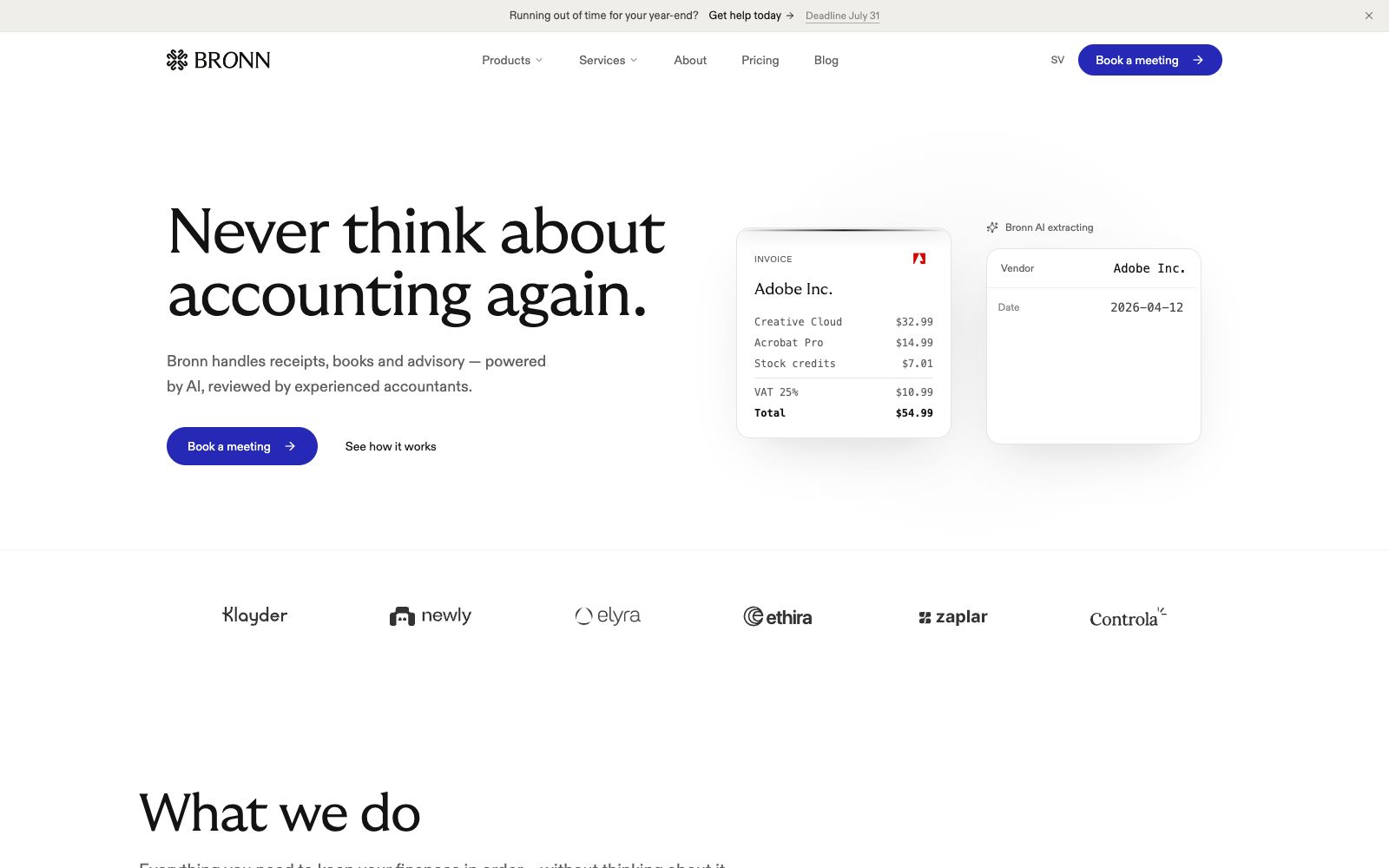
AI and workflow brands are moving away from magical future-talk and toward proof panels: fields, documents, review states, and concrete outputs.
Communicates
Dependability, speed, human supervision, and lower operational anxiety.
Works Where
AI services, finance workflows, enterprise tools, legal and accounting products, internal ops platforms.
Risk
Invoice cards, extraction panels, and calm serif headlines can become a generic AI trust costume if the product evidence is not specific.
Bronn / AI-native accounting
2
Belonging Gets Softly Exclusive
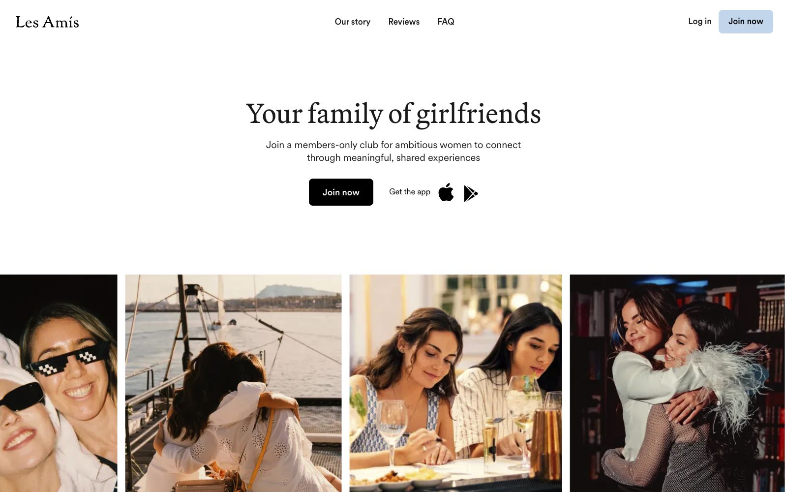
Community products are calming down. The visual language is less feed, more club: serif confidence, spare UI, warm snapshots, and membership ritual.
Communicates
Trust, curation, emotional safety, aspiration, and social intimacy.
The club signal can feel exclusionary or stock-lifestyle if the rituals, proof of value, and member specificity are not visible.
Les Amis / membership community
3
Commerce Turns Into A Place You Can Enter
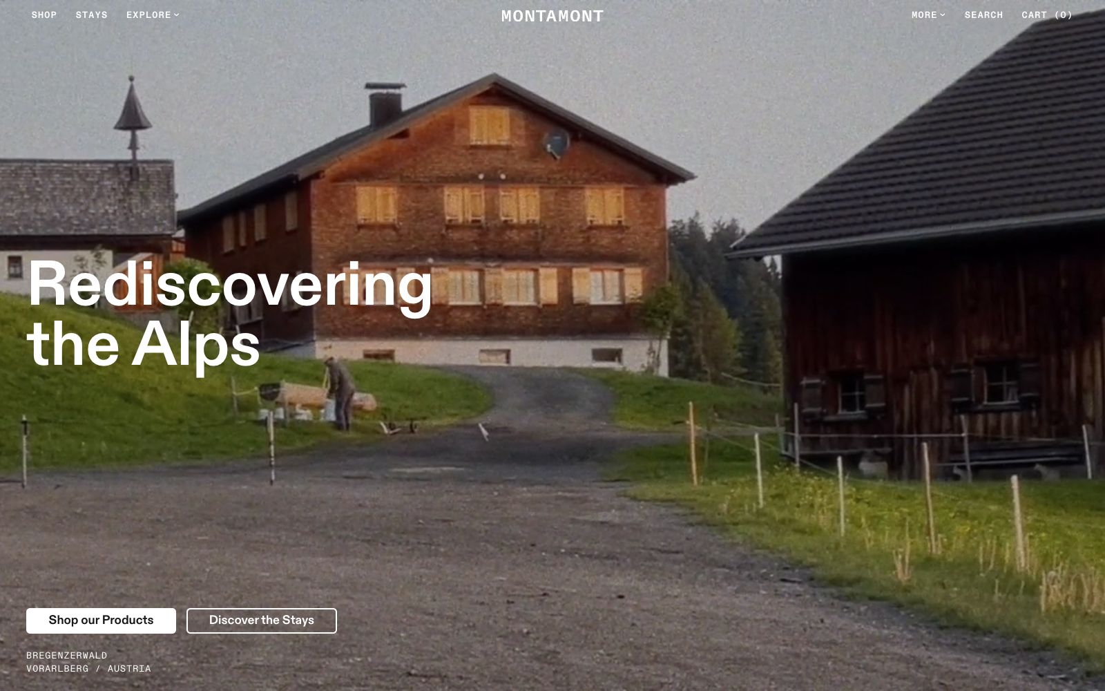
Retail and platform brands are using documentary texture and real environments to create belief before the offer is explained.
Communicates
Provenance, local texture, sensory memory, and confidence through atmosphere.
Works Where
Travel, retail, food, fashion, local business platforms, premium lifestyle goods.
Risk
Atmosphere can delay utility. If the product or offer arrives too late, the site starts reading as a mood reel instead of a business.
Montamont / alpine destination commerce
Pattern Clusters
Type-led clusters only, kept separate from the image-heavy reference library.
Design System As SKU
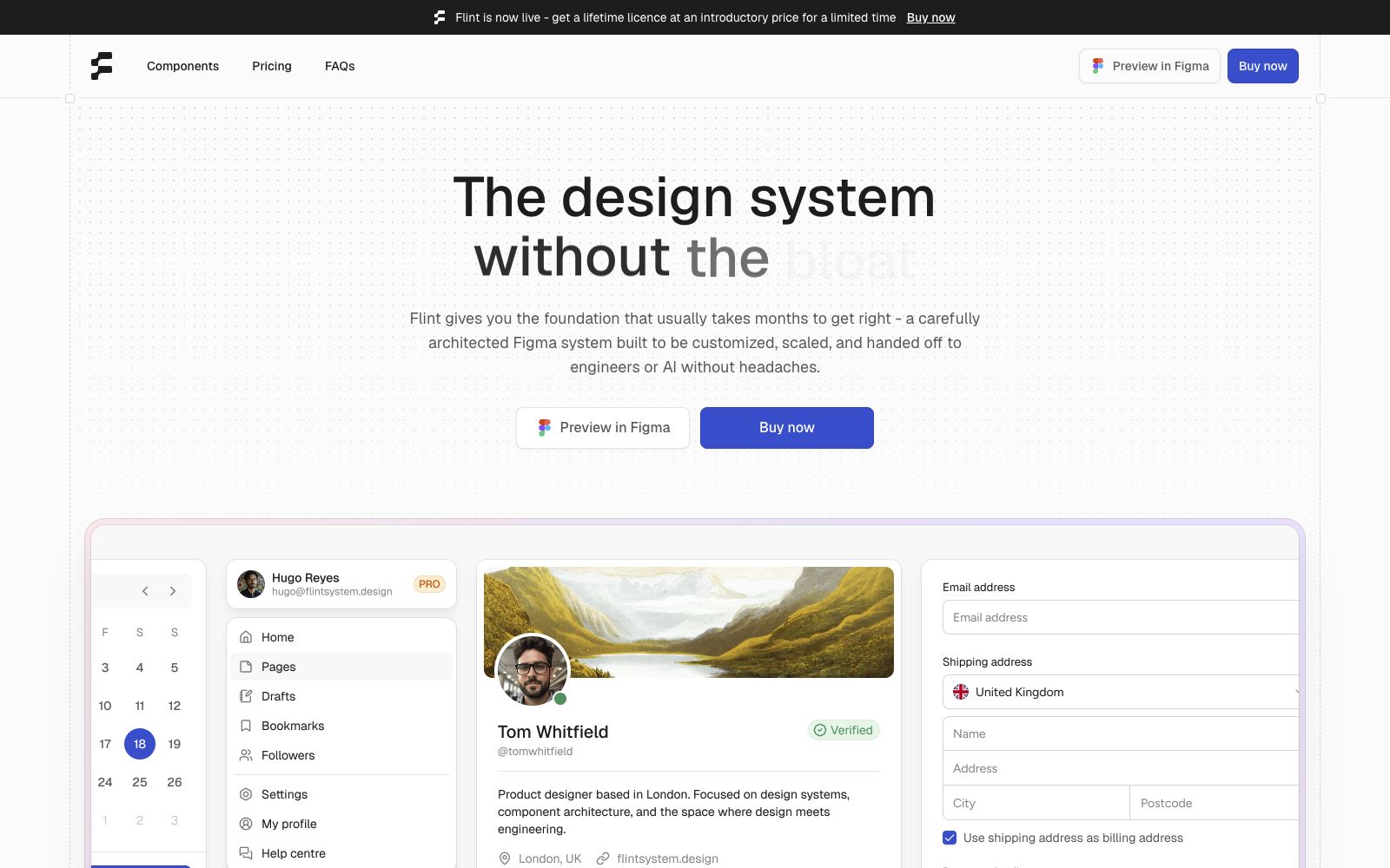
Design infrastructure is being sold with the polish of a finished product. The component library becomes a marketable artifact, not just an internal asset.
Receipt-Based AI
AI brands are showing invoices, fields, extracted values, dashboards, and review language before conceptual claims. The signal is operational trust.
Clubhouse Social Proof
Community products are replacing feed energy with calm serif hierarchy, soft photography, and private-membership language.
Place-Based Commerce
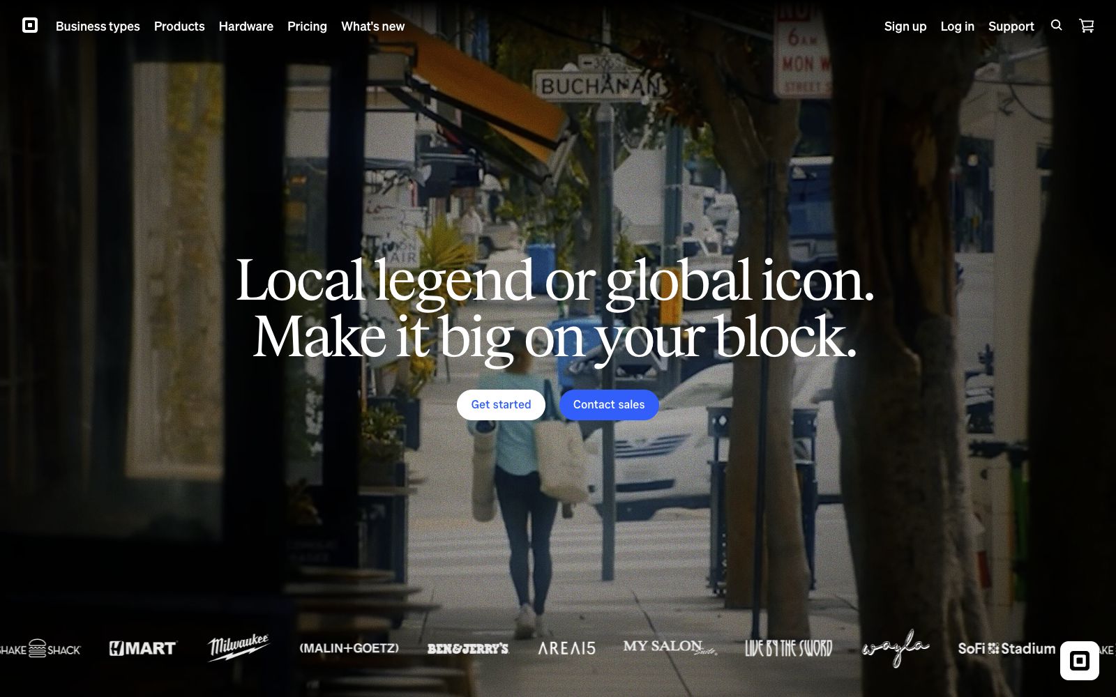
Commerce pages are leaning on real location texture: street footage, alpine houses, cropped garments, and documentary-feeling imagery.
Archive Grid Authority
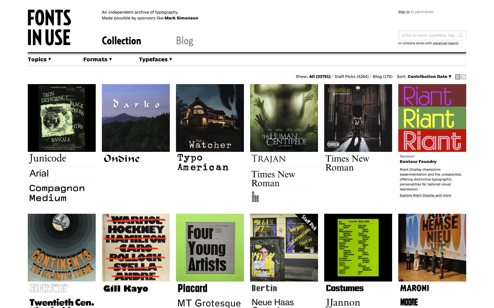
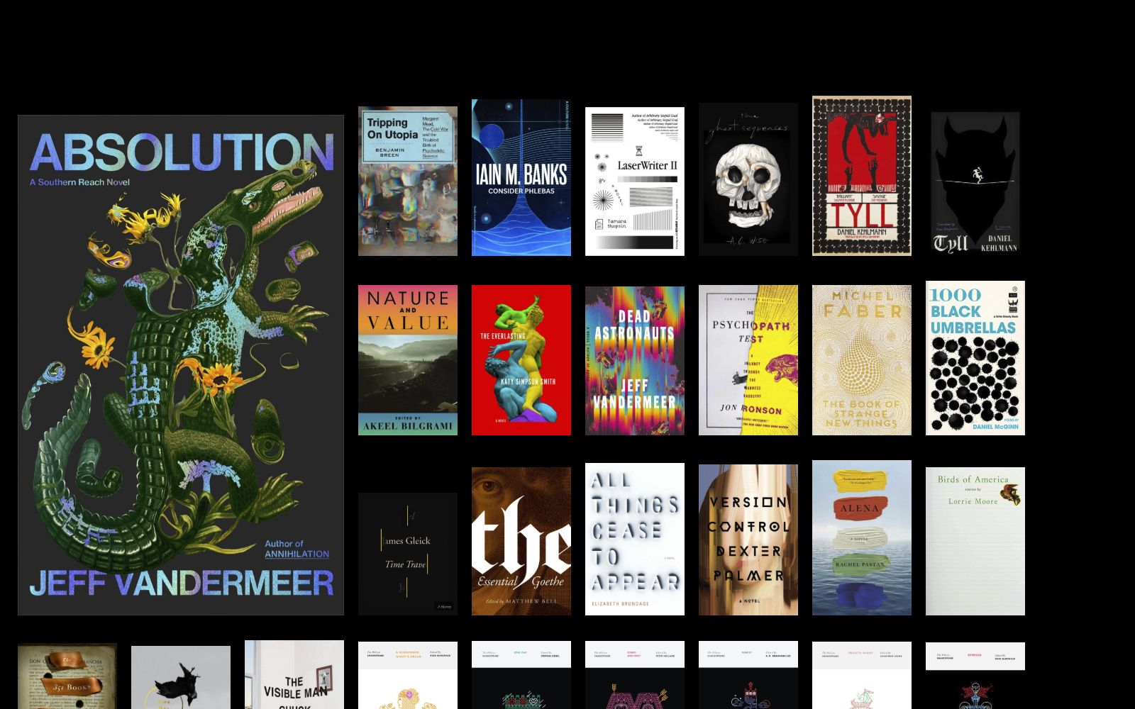
Reference libraries and cultural archives turn provenance into taste. The grid says: this is not mood, this is evidence.
Reference Library
Each reference gets its own row with generous screenshot real estate. The library is the main artifact.
Bronn leads with a plain operational promise, then immediately shows invoices, extraction, dates, vendors, and reviewable fields. The visual argument is not magic; it is less accounting anxiety.
Fonts In Use keeps the archive utilitarian: specimens, font names, contribution sorting, and visible provenance. The lesson for brand systems is that taste gets stronger when its evidence trail is visible.
Flint makes a Figma kit feel like a serious operating layer: dotted grid, component previews, pricing, FAQs, and handoff language all make design ops feel shippable.
The archive makes cover logic legible at a glance: scale, genre, color, authorship, and symbolism stack into a visual language library for anyone building identity systems.
Les Amis swaps feed chaos for serif calm, centered hierarchy, soft snapshots, and membership language. It makes ambition feel social, curated, and emotionally protected.
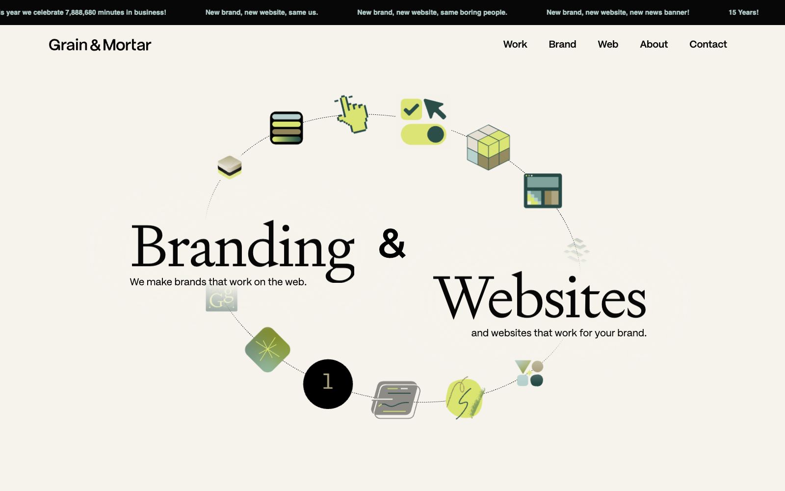
Agency credibility turns into an operating diagram.
The site breaks the agency pitch into a circular system of playful tool icons, oversized serif type, and a self-aware banner. It sells craft as an approachable working method.
Montamont leads with a documentary-feeling alpine frame, blunt white type, and sparse commerce cues. The product world is not polished first; it is situated first.
Place MemorySlow TravelDocumentary PremiumAlpine Texture
Square puts the business platform inside a lived local scene, then overlays a big cultural claim and customer logos. Scale is made believable through block-level specificity.
Local ProofCinematic B2BStreet TextureCustomer Logos
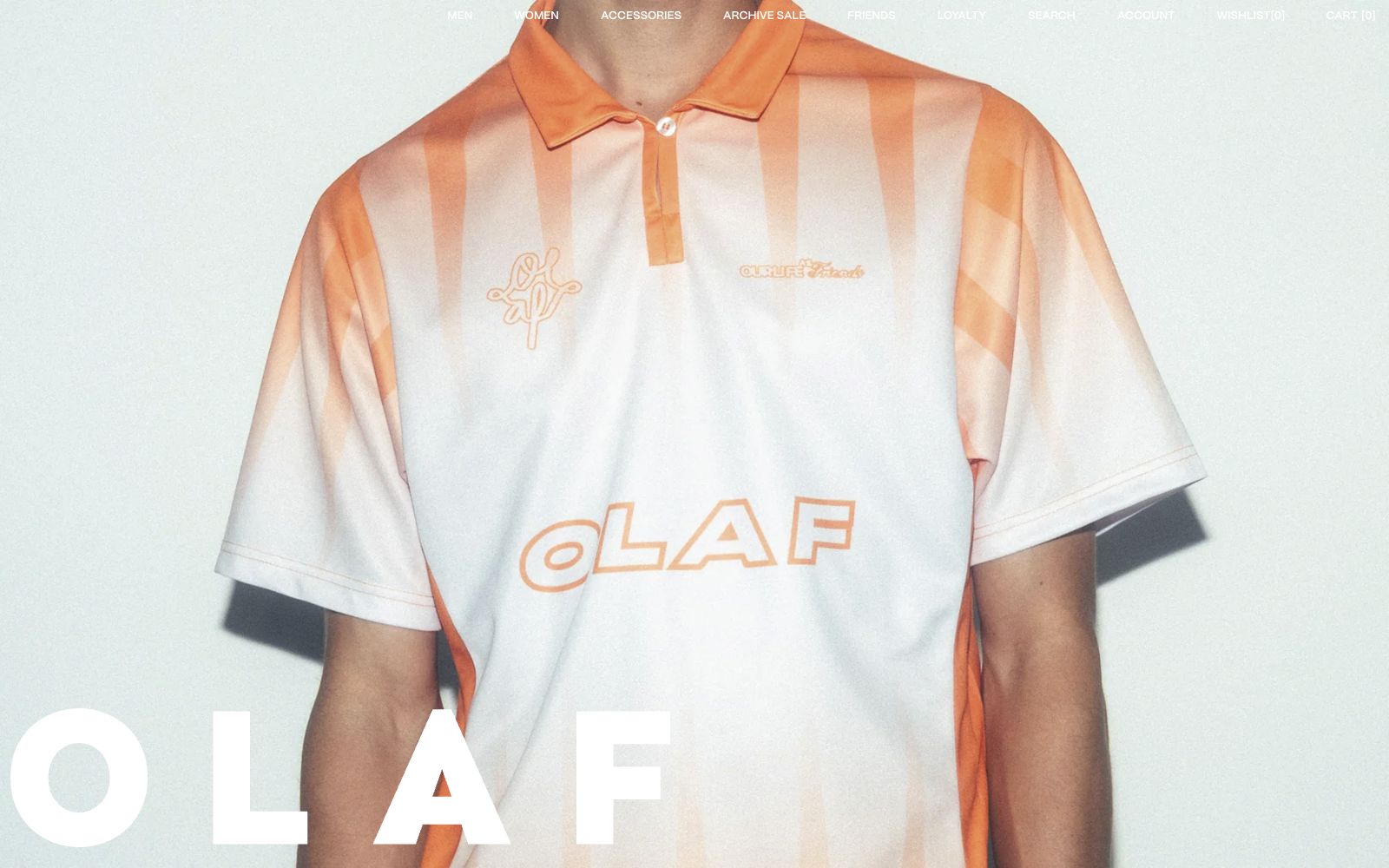
OLAF uses a close product crop, pale flash texture, and giant partially cropped wordmark. The ecommerce hero behaves more like a campaign poster than a catalog entry.
Take one brand hero and force the first screen to show one concrete proof object before the poetic claim: an invoice field, specimen grid, customer logo band, material detail, member ritual, or product component. Then add only enough atmosphere to make the proof memorable. Measure whether the page feels clearer without becoming dull.