Creative Signal Report: The Mark Becomes the Method
A logo increasingly does more than sign its name. In this set of contemporary identities, marks become reusable visual rules, methods of making become recognizable brand material, and civic graphics are built to communicate access and participation. This is an interpretation of nine documented projects, not a quantitative claim about the whole industry.
Top Signals
Three strategic readings, each anchored in documented project evidence.
1
Identity Becomes a Working Grammar
The same formal mark can organize information and react to context, rather than appear only as a logo.
Belonging, legibility, public purpose and navigable participation.
Works Where
Public institutions, community programs, multilingual events and cultural organizations.
Risk
Visual inclusion can overpromise when language access, real services and participation pathways remain unchanged.
Illinois Department of Human Rights / primary studio case study / captured 2 November 2026
Pattern Clusters
Four repeatable moves across this selection.
Motif as Component
A core shape becomes a modular unit used to frame, connect or orient content. The visual system is easier to scale because the rule is transferable.
Method as Artifact
Production materials and gestures are visible in the finished work. Process becomes a way to make claims about authenticity concrete.
Language Equity in the Grid
Multilingual typography can express equal presence through shared scale and composition rather than an afterthought translation tier.
Place as Working Geometry
Maps, physical environments and regional materials supply recognizable geometry, turning local specificity into a repeatable identity system.
Reference Library
Inspected browser captures show the page used as evidence. Captions distinguish live sites from documented case studies.
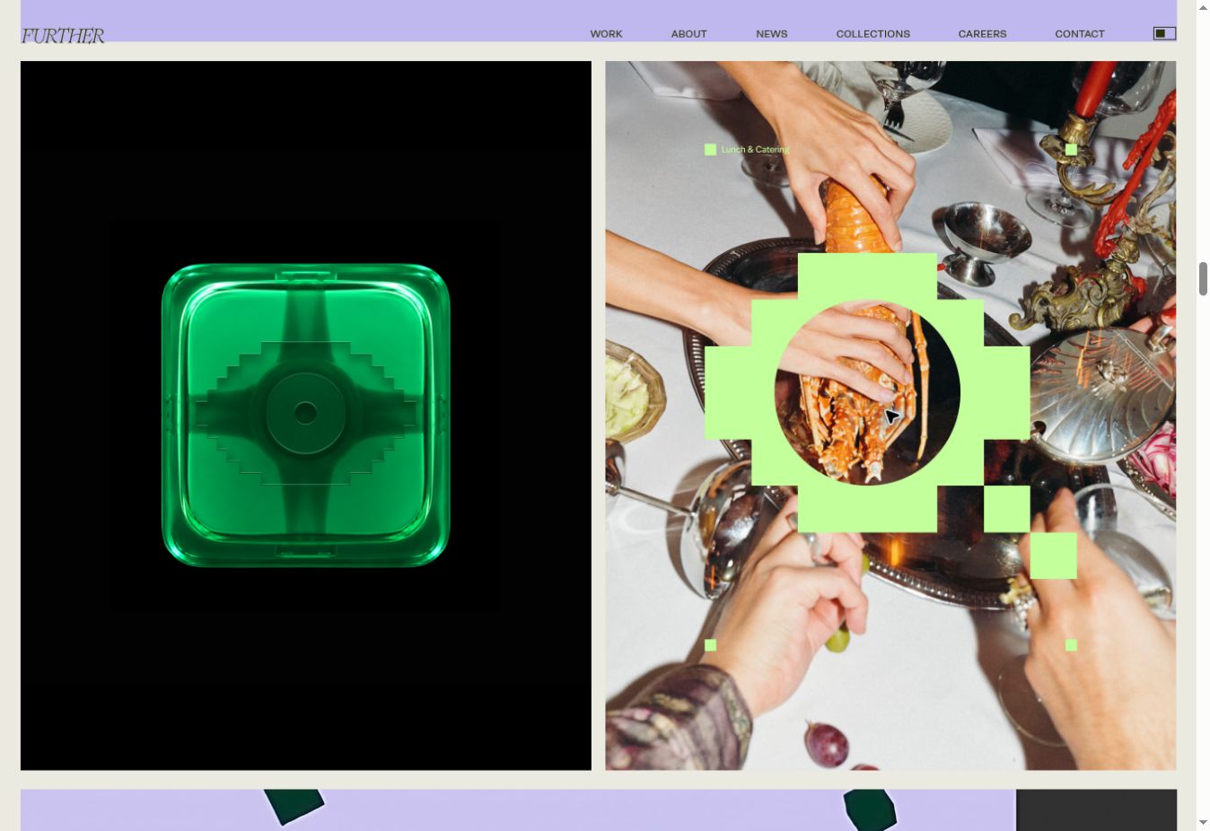
Trustpilot / primary studio case study / captured 2 November 2026
Trustpilot / Review platform / brand system
The Star Becomes a Rule for Arranging Voices
Strategic Interpretation
Further breaks Trustpilot’s familiar star into a modular grid and framing system that can hold individual reviews, scale across merchant widgets and convey aggregate trust. The visual promise is that testimony can be organized without being made anonymous.
Modular symbolReview architectureTrustResponsive system
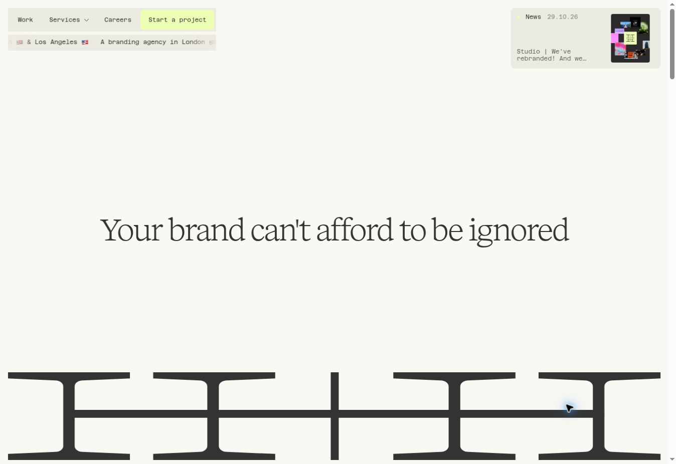
HOW+HOW / direct live homepage / captured 2 November 2026
HOW+HOW / Creative studio / identity
The Volume Metaphor Controls the Mark
Strategic Interpretation
An H+H logo stretches like an analog fader, translating the studio’s strategy of amplifying a brand’s singular truth into a reusable formal rule. A logo can vary considerably while its underlying behavior remains recognizable.
Variable identityVolume dialStrategy-to-formElastic mark
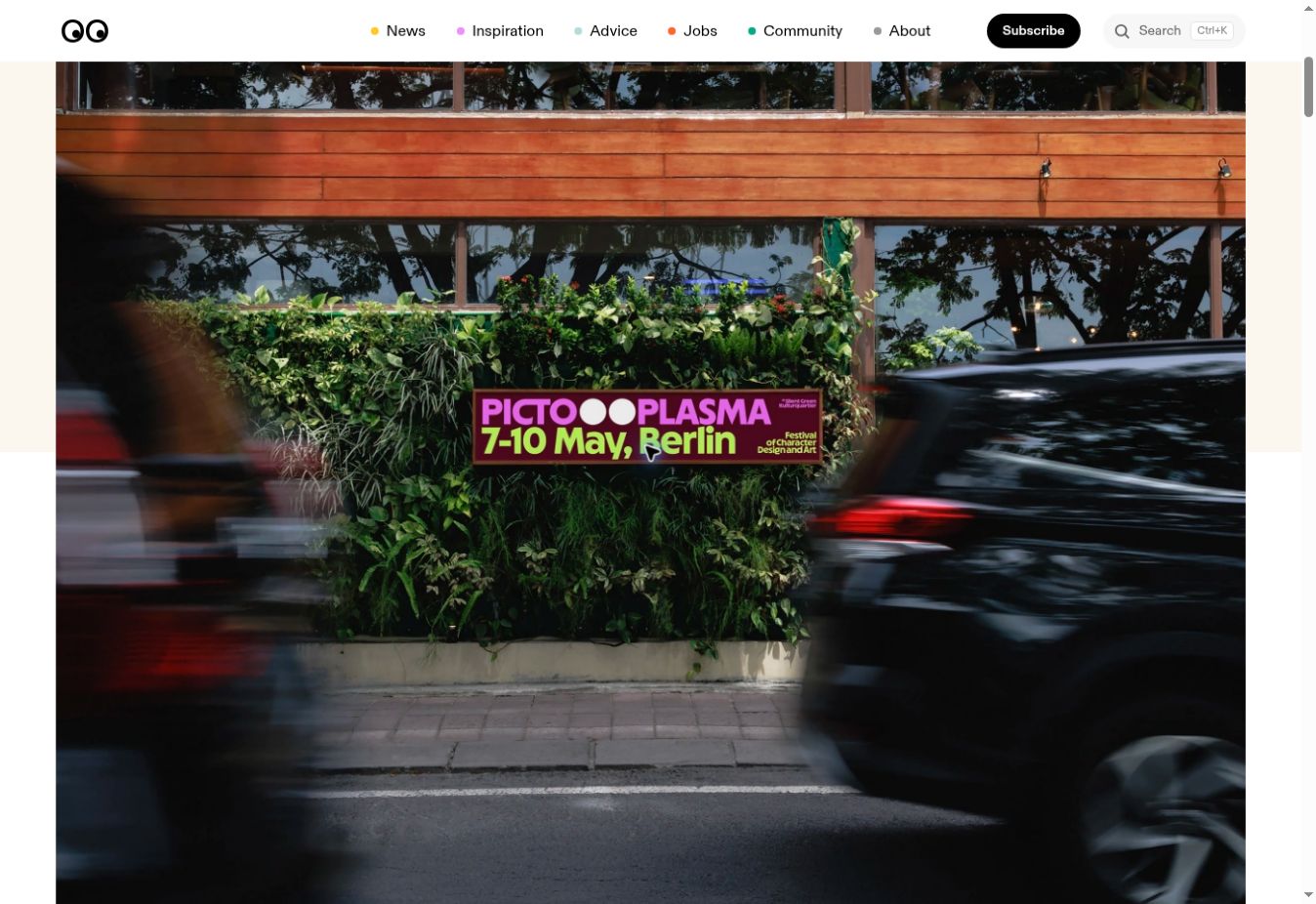
Pictoplasma / documented editorial case study / captured 2 November 2026
Pictoplasma / Character-design festival / identity
Two Dots Turn Typography into a Character
Strategic Interpretation
In andstudio’s festival identity, punctuation-like dots read as eyes; the wordmark gains character without competing with the artists the festival showcases. One minimal device allows an identity to convey its cultural subject.
Source article: 2026-10-14
The October article documents a 2026 event identity; the photographed banner advertises May 7–10. October is not treated as the launch date.
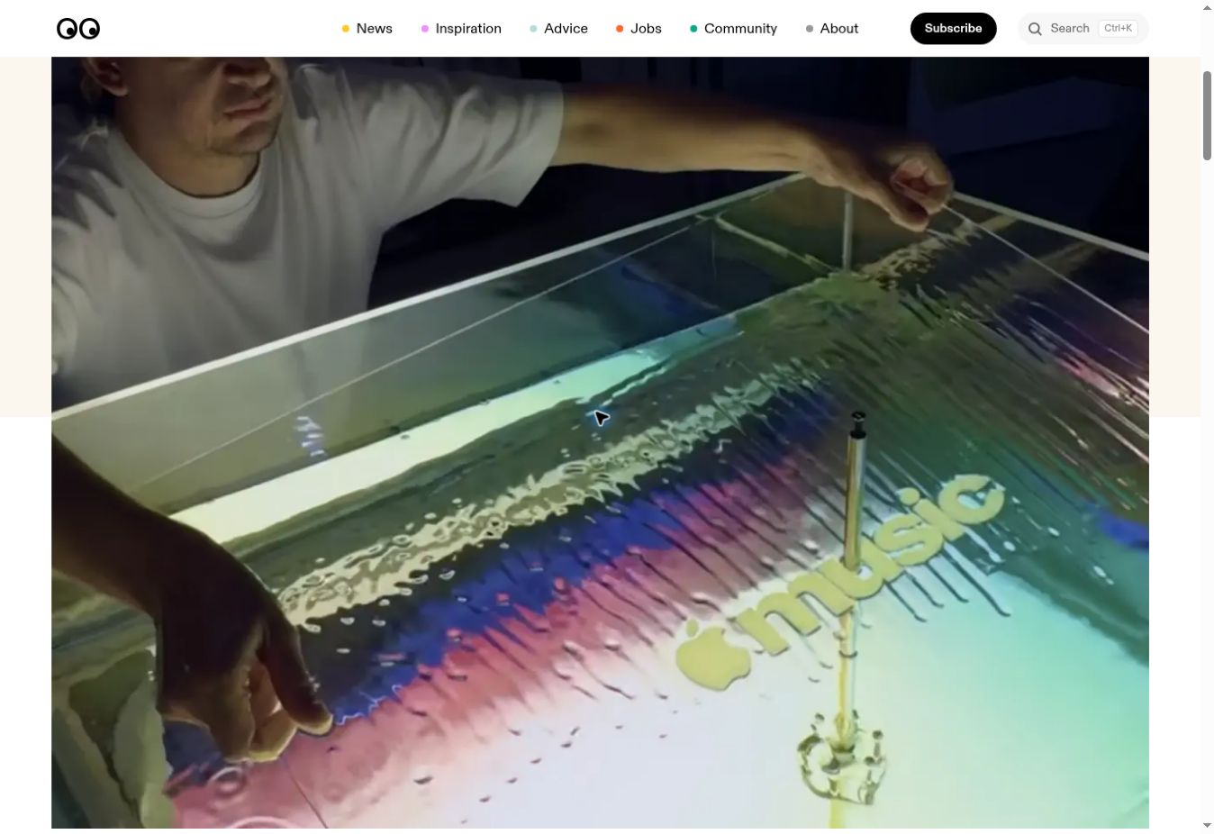
Apple Music / documented editorial case study; process image / captured 2 November 2026
Apple Music / Streaming / sonic identity
Sound Makes the Visual
Strategic Interpretation
Music was played through a transducer in mineral oil and filmed. The captured ripples form the visual identity and sonic signature, giving the mark an actual physical relationship to the service’s medium.
Source article: 2026-10-22
TBWA\Media Arts Lab; Fred Again; NEST Acoustics; Plau (type consultation)
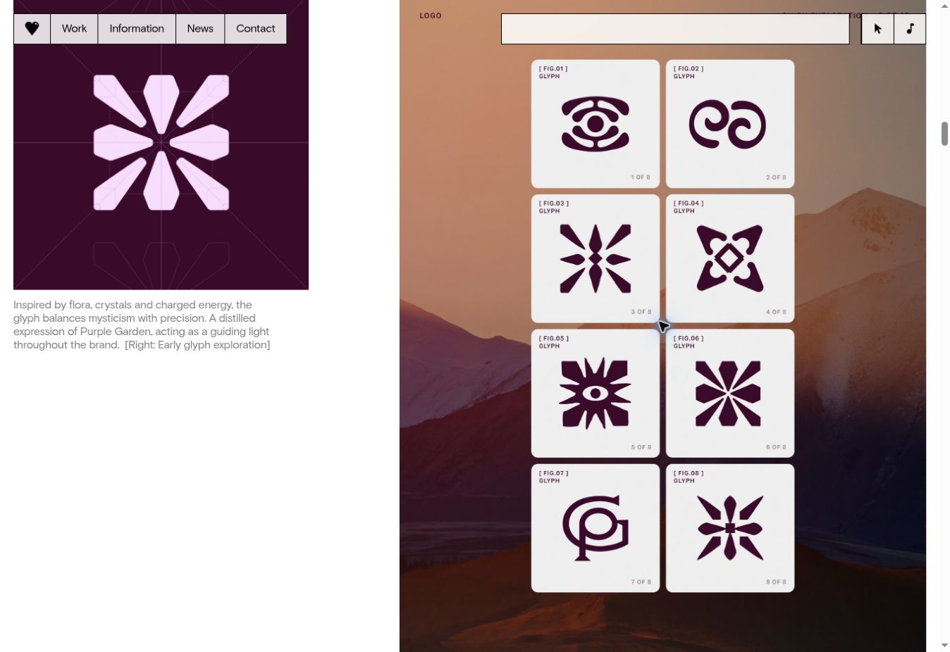
Purple Garden / primary studio case study; drawing development / captured 2 November 2026
Purple Garden / Spiritual guidance / digital product
An Exploratory Ritual Supplies the Image Vocabulary
Strategic Interpretation
Mother Design developed forms through charcoal drawing and guided activities, then translated their irregularity into motifs, typography and interface cues. The methodology borrows from the audience’s practice; the risk is that atmospheric claims can overtake service clarity. The primary case study also discloses a later process moving between traditional tools and AI, so the finished system should be understood as a hybrid workflow.
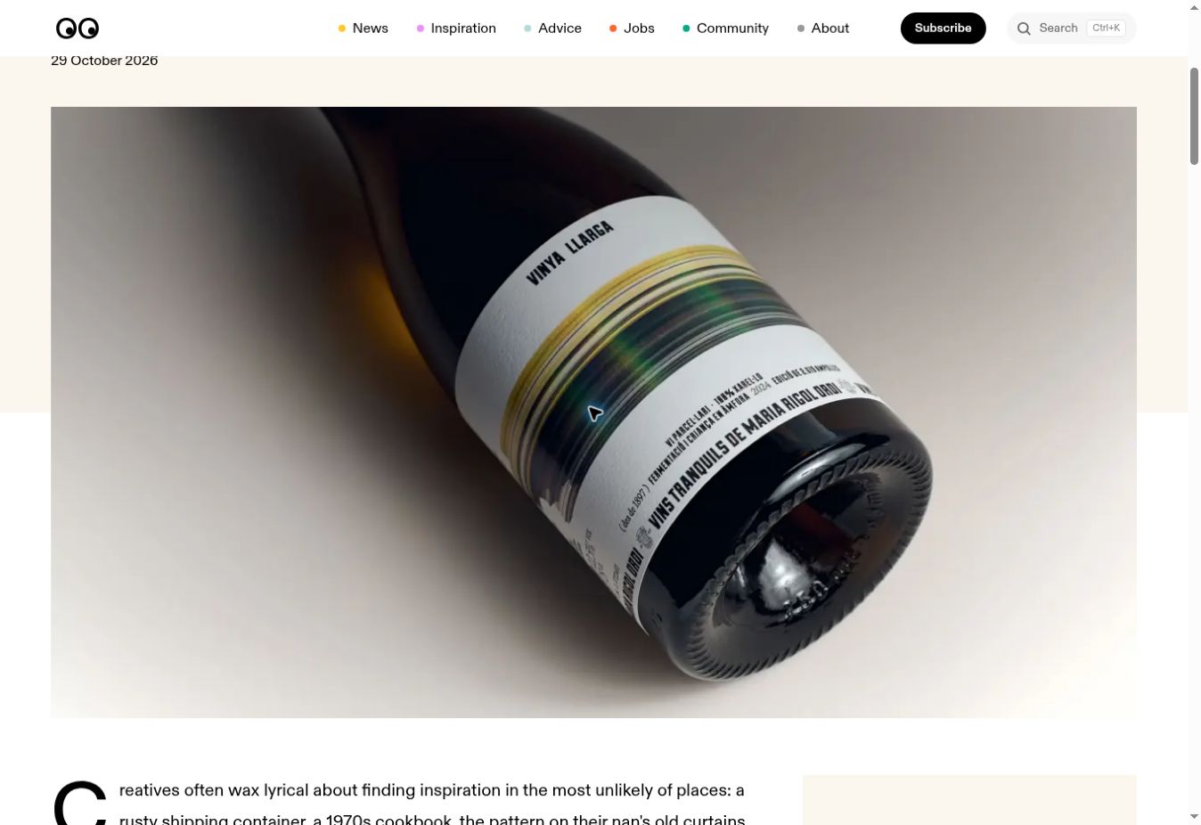
Vinya Llarga / documented editorial case study / captured 2 November 2026
Vinya Llarga / Wine / packaging
A Long Vineyard Is Rendered as a Long Exposure
Strategic Interpretation
Atipus translates the Catalan name for a long vineyard into streaks of landscape colour that wrap around the bottle, suggesting speed and extended terrain. A simple formal move communicates the product’s origin while preserving restrained information hierarchy.
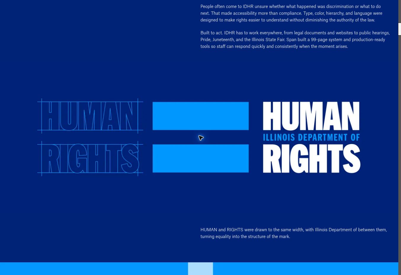
Illinois Department of Human Rights / primary studio case study / captured 2 November 2026
Illinois Department of Human Rights / Civic service / institutional brand
The Equal Sign Becomes a Rights-Facing Communication Kit
Strategic Interpretation
Span positions a bureaucratic identifier between the two large words HUMAN and RIGHTS, forming a typographic equal sign. The identity extends into ready-to-use public information, signage and outreach materials, giving the institution a stronger public-facing purpose.
Source article: 2026-10-28
Span; Nick Adam; Illinois Department of Human Rights
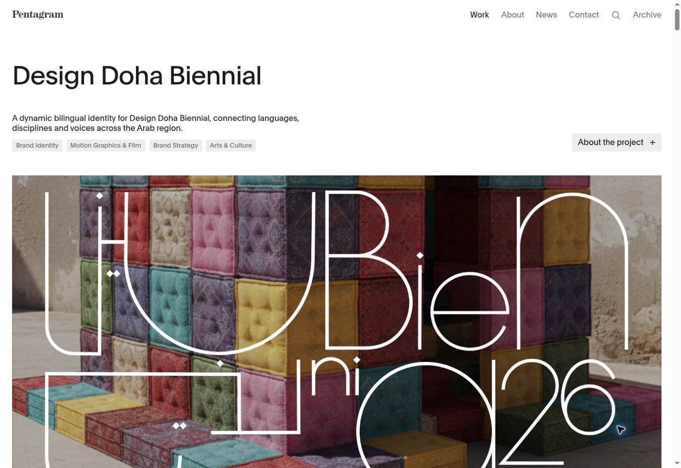
Design Doha Biennial 2026 / primary studio case study / captured 2 November 2026
Design Doha Biennial 2026 / Cultural event / bilingual identity
Language Parity Is Built into the Typographic Mechanism
Strategic Interpretation
Arabic and English share equal presence in one flexible letterform framework. Long strokes link words and formats as network paths, making connection part of the layout rule rather than a theme added afterward. The event opens November 5; this reference is a published identity preview.
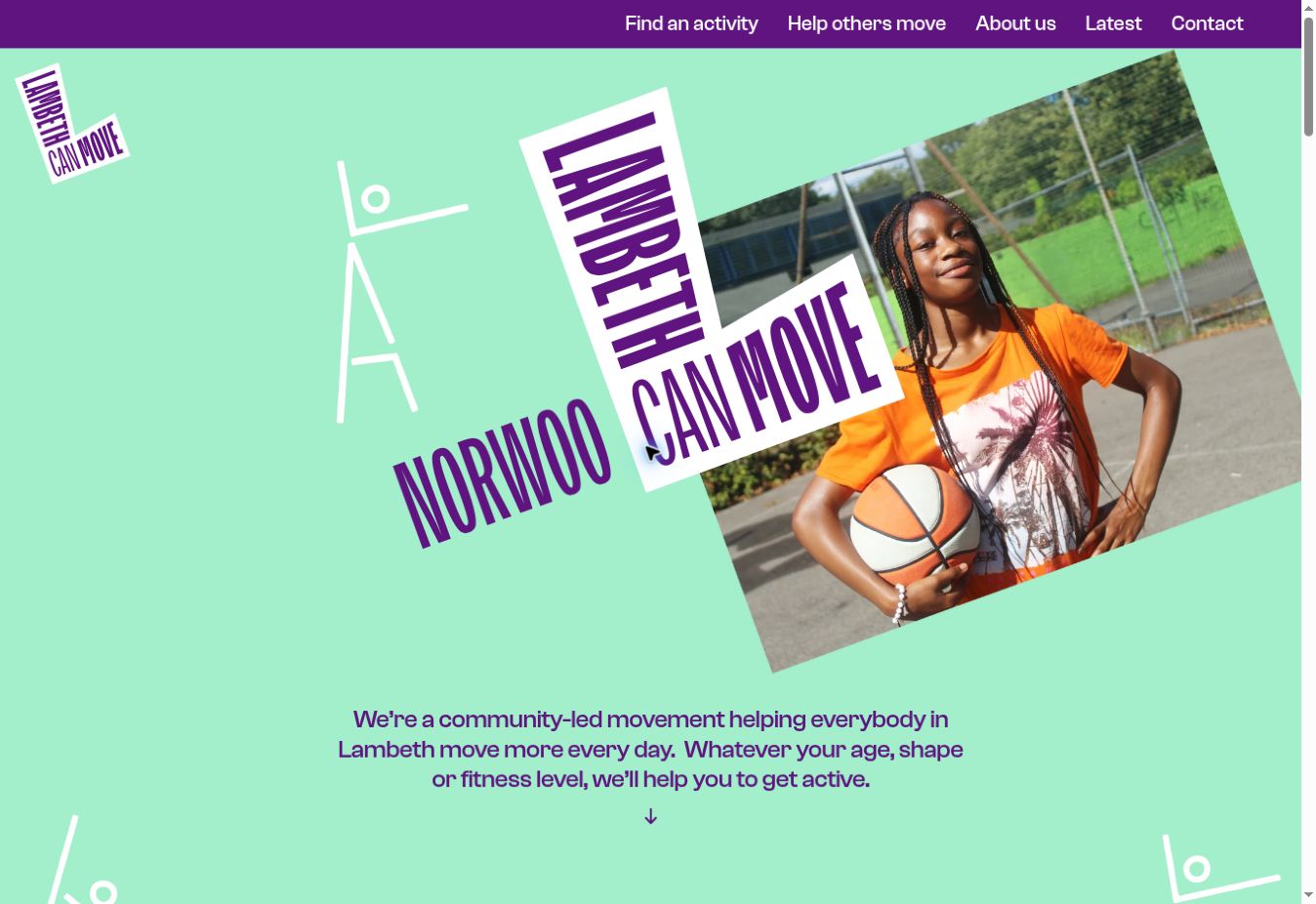
Lambeth Can Move / direct live homepage / captured 2 November 2026
Lambeth Can Move / Community health / civic identity
Neighborhood Maps Become Moving Figures
Strategic Interpretation
Shapes drawn from six pilot area maps become elongated L-figure illustrations that walk, stretch and move. The visual system gives distinct neighborhoods a shared campaign language without erasing their local geography.
One test of whether a brand promise can become a useful design rule.
Make the Promise Work as a Rule
Choose one meaningful product or organizational promise, such as clarity, fair access or transparency. Design three treatments: (A) a static brand mark, (B) that same motif as a reusable compositional rule, and (C) the motif as a purposeful orientation or feedback mechanism in one actual user task. Show all three to 6–10 participants without explanation; test recognition after five seconds, task completion, and whether the mechanism increases or obscures understanding. Keep the variant that improves task performance or understanding; expressive form should support that result.